
Luma
A mental health app where the design itself was part of the treatment.
Overview
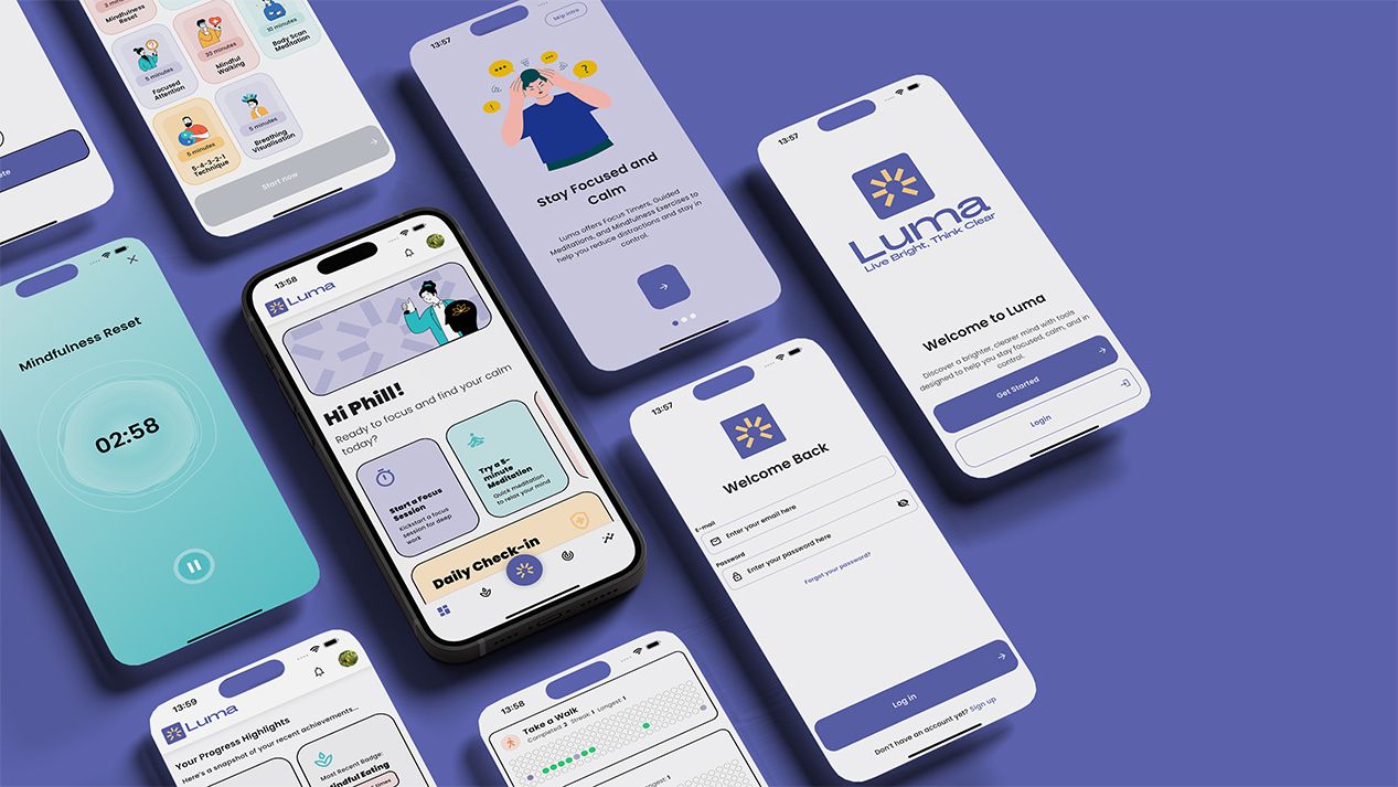
Luma is a mental health and mindfulness app built around helping people manage anxiety, build self-awareness, and develop a calmer relationship with themselves. The studio designed Luma's full brand identity, the visual system, the app interface and the user experience. Across iOS, Android and the supporting web presence.
The work won DesignRush's App Design of the Month in 2024.
The challenge
What made the work worth doing.
Mental health apps have a problem the rest of consumer software doesn't. The interface isn't a neutral container for the product. It is the product. Every typographic choice, every transition, every colour, every animation either supports the user's nervous system or works against it. A wellbeing app with anxious design makes its users more anxious. A meditation app that feels demanding makes meditation feel like another job.
Most mental health apps don't solve this. They borrow visual language from productivity software, fitness tracking, or social media. Categories built for stimulation, not regulation. The result is wellbeing tools that feel like the things people are trying to escape from.
Luma's founders understood this from the start. The brief wasn't "make it look calming." It was: the app has to do part of the therapeutic work itself, before any feature is used. Open the app and feel different. Read a screen and feel held. Tap through onboarding and arrive somewhere quieter than where you started.
That's a design problem with no shortcuts. You can't fake it with stock imagery and pastel colours. The whole system has to be built on a real understanding of how people in distress experience digital interfaces.
The approach
How the work got done.
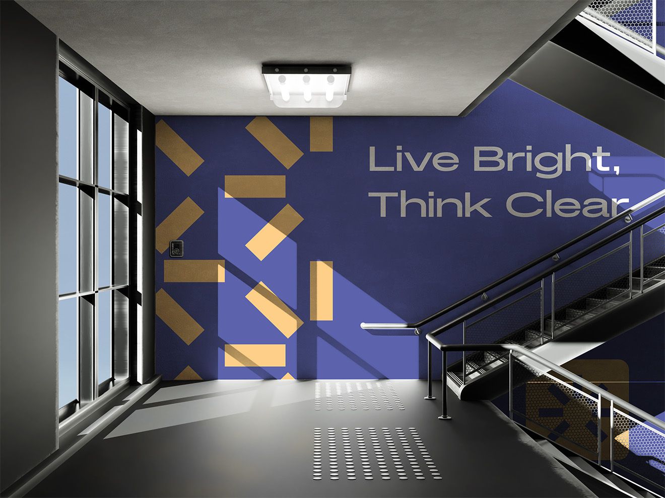
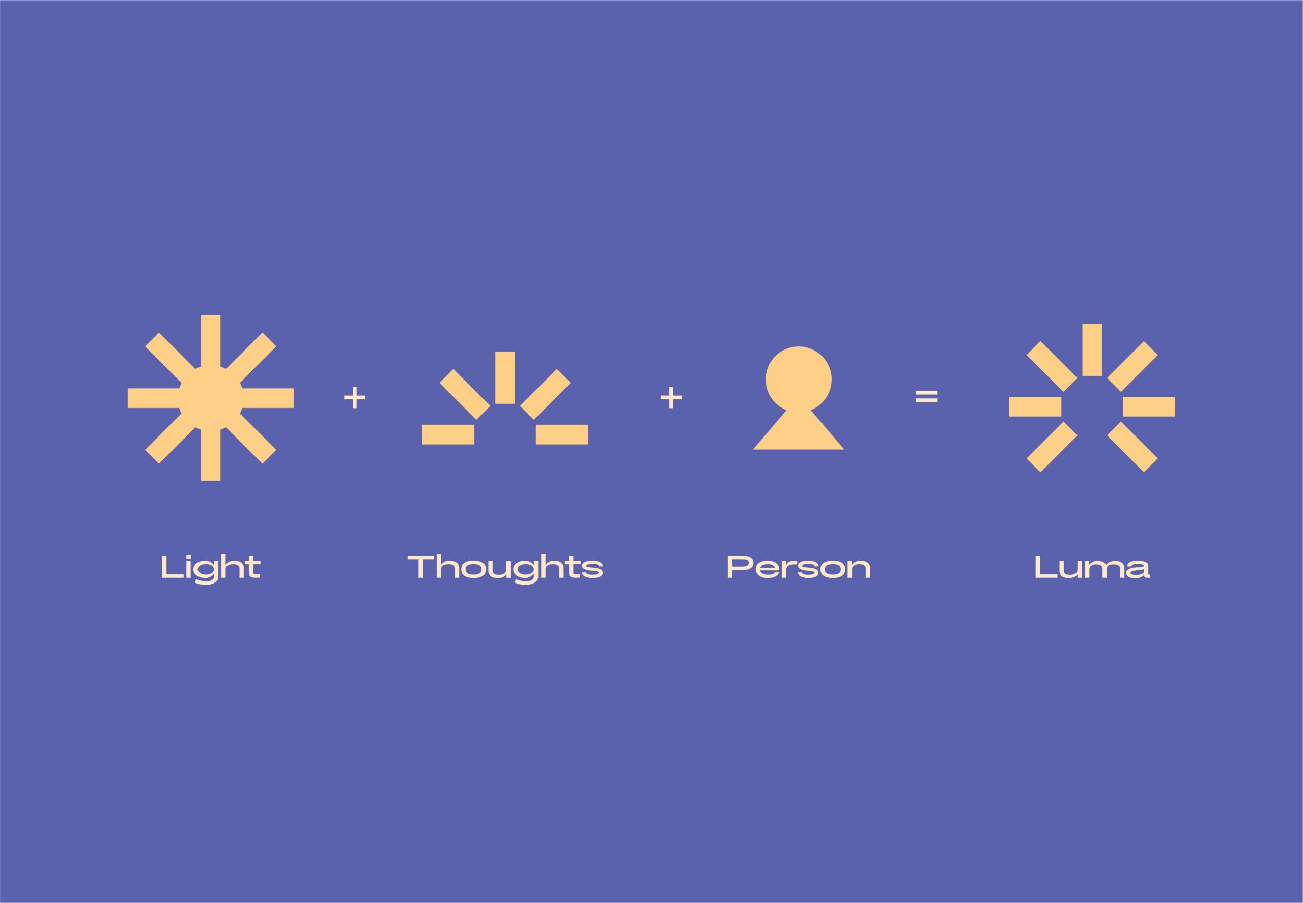
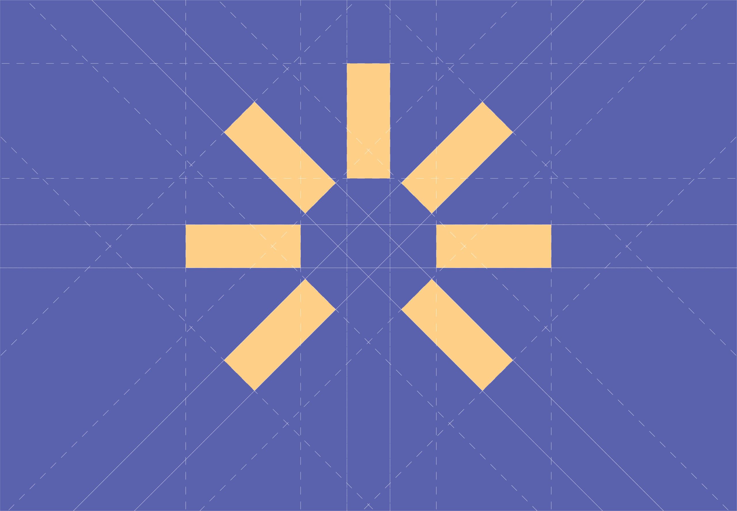
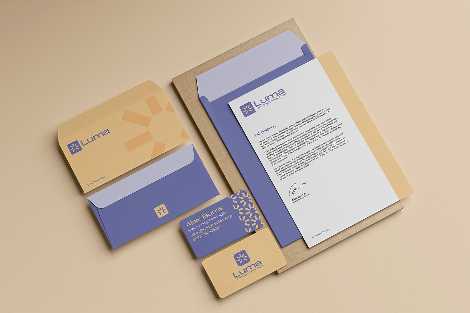
The brand had to feel earned, not engineered. The identity work avoided the visual clichés of the wellbeing category. No watercolour washes, no botanical illustrations, no soft-focus stock photography. Instead, the system was built around a confident, slightly serious aesthetic. A typographic identity that reads as considered, not precious. A colour palette anchored on warm neutrals with deliberate accents. Imagery that felt grounded rather than aspirational. The brand says "this is real, this is for you, this isn't trying to sell you a vibe."
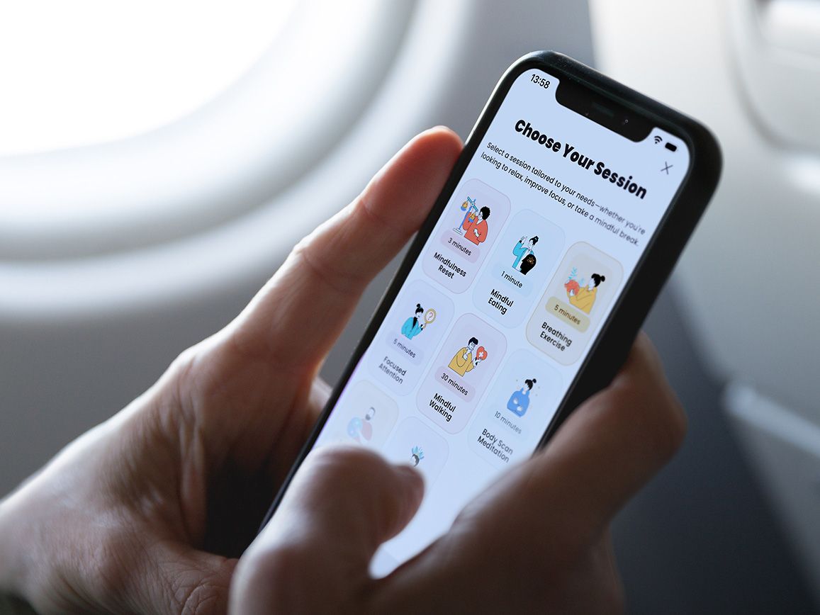
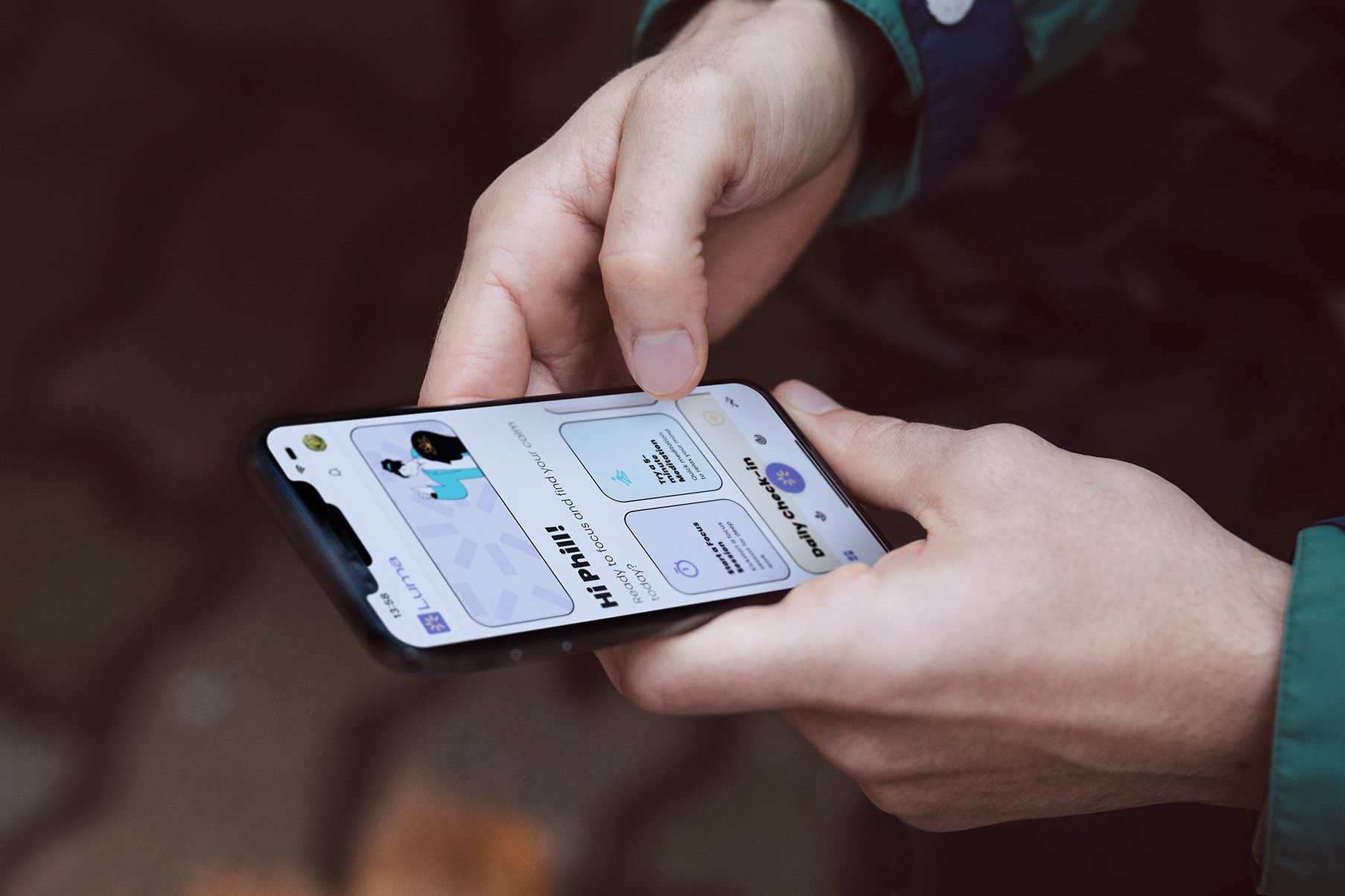
The interface had to be slow on purpose. Most app design optimises for speed and engagement. Fast taps, instant feedback, dopamine loops. Luma deliberately did the opposite. Transitions are longer than convention says they should be. Onboarding doesn't rush. Empty states are quiet. Notifications are restrained to the point of being almost absent. Every micro-decision was made by asking what would help a user in distress, not what would maximise time-in-app.
Typography did real therapeutic work. Reading copy in moments of high anxiety is hard. Text that's too dense, too small, or set with too-tight leading adds cognitive load and is harder to parse. Luma's typography was set with generous line-height, slightly larger body sizes than convention suggests, and clear hierarchy that lets users skim when they can't read deeply. Every screen was designed to be readable in the worst-case user state, not the best-case one.
Selected work
Outcomes
What changed.
Luma launched into a category dominated by larger, better-funded competitors. The brand and product work earned the kind of recognition that's hard to engineer:
The numerical outcomes belong to the product team. The design outcome (that the work itself does part of the job the app is trying to do) is the part the studio takes responsibility for.
- Won App Design of the Month at DesignRush in 2024
- Featured as an example of considered mental health design in industry conversations
- User research after launch consistently surfaced the same theme. The app *felt different* from other wellbeing tools, in a way users struggled to articulate but reliably noticed
- The brand and product work continues to set the visual and experiential bar for what the category should look like
Reflection
What this project means.
Luma is the project that defines what the studio means by "outcomes over outputs." The output was a brand and an app. The outcome was a product where the design is doing therapeutic work that no feature alone could deliver.
This is the work that's hardest to argue for and most important to do. Plenty of agencies would have delivered a calming-looking app on this brief. The work that mattered was the harder version. Designing for the user's worst day, not their best day. Slowing things down when the rest of the industry says speed up. Trusting that restraint reads as care.
Every wellbeing project the studio takes on now starts from the lessons Luma taught. And the broader principle (that brand and design can do real, measurable work in people's experience of a product, not just decorate it) runs through every engagement, in every category.
Got something similar in mind?
Let’s talk through it.
A free 30-minute call to size the work, share rough numbers, and see if we’re a fit.
Start a project