
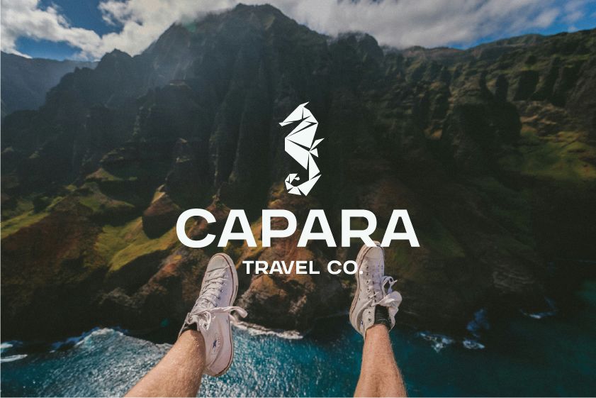
About the project
Capara Travel came to Level44 with a clear vision: a tailor-made travel service built on personal expertise, ethical tourism, and a refusal to follow the well-worn path of the corporate travel industry. We led the project end-to-end, developing the full brand identity, naming, positioning, and tone of voice. The custom origami seahorse mark layers three ideas into one symbol — nautical discovery, Japanese-inspired craft, and the seahorse's own associations with safe passage and grace under pressure. Around it sits a nature-rooted palette of Deep Sea Green, Tidal Green, and Copper Compass — a deliberate move away from the predictable blues and oranges that dominate the category. The result is a brand that feels premium, approachable, and unmistakably connected to the natural world Jenny's clients explore — built to grow with the business and its community of repeat travellers.